So, you’ve finally done it. You’ve agreed on the lease for which you’ll let out room to run a retail store, you have your branding and idea defined ahead of time, inventory to sell, and the ability to really run this space how you’d like to. We wish you all the luck in the world.
However, while you now have access to the space, the fun bit is still left to do. This involves designing a retail store layout, in humble fashion, to make sure that your spend per head is increased and the natural, logical span of the environment is conducive to visitors finding what they’d like (and what they may not have expected to desire).
Sure, this might sound easier said than done – well, that’s because it is. Depending on the kind of store you have, your priorities can also change quite significantly. In this post, we’ll discuss how to design a retail store layout, how it can help, and the considerations worth thinking about from then on:
Safety & Fire Preparations
The most important matter to attend to within any business is that of safety. This is important no matter what. Making sure that evacuation protocols are clear and consistent, and that exists are marked is more than worthwhile, it’s fundamental to structuring your navigable space.
In this case, bright green ‘exit’ signs may be applicable, as well as clearly showcasing where locked doors may be situated so that those trying to evacuate don’t head to that area first. Safety preparations also means ensuring that wet floors are marked, as well as avoiding hazards that could occur, such as trip hazards, or stacking too many items on top of each other to the point where falling over is not only possible but likely.
Regular safety inspections will be carried out by the local business authority, but it may be that using a private firm for your own audit can help you hold higher standards than those that may be required. After all, we should always focus on zero acceptable injuries on our premises no matter how idealist that number is to chase.
Like Items
In order to maximize the sales of our goods, it’s a great idea to bundle like items together in their displays, so that one purchase necessitates another. It might be that your market store has a new grilling section, where disposable grills are sold. Now, might that be better off sold in the section near the other home furnishings, or where the steaks and sausages might be presented, a little further away but still within view?
This can be applied to many different purchase options you view as necessary and relevant. This will depend on what you sell and why you sell it. An introductory pack of goods for a first-time gym-goer might work wonders, for instance, especially for those on the fence about completing their purchase for the first time.
Hidden, Adult-Oriented Items
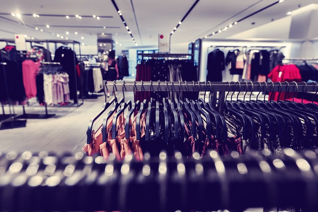
It might be that depending on what you stock, you wish to leave the more mature or sensitive items for a certain area of the store. To use an example, a beautiful women’s boutique fashion store is unlikely to place its lingerie collection near the front of the entrance as soon as you walk in. Of course, that’s not to say there’s anything wrong or shameful about buying these items, just that it might be a little more appropriate to have these near the end of your store layout, where someone can walk in and feel a sense of privacy looking through the items on sale. Furthermore, parents with children won’t have to walk past such undergarments and feel slightly uncomfortable or put off when doing so.
This doesn’t just have to relate to those matters, obviously, as alcohol and other adult-focused items are usually found in the last aisle of any supermarket too. Such an understanding will help you take a mature and reasoned approach to your store design.
Worthwhile Units
It’s good to think of the display units that will be utilized when displaying your items. A great island display case can serve as a perfect implement between two aisles, for instance, while allowing more overhead room to view the entire store.
A larger display cabinet might be key for keeping items at a certain temperature so that they can remain preserved. Units that allow for the display of samples can also help you potentially entice new customers regarding parts of your product line. You may have also seen unique display units that work for a particular type of product, such as spinning displays that hold a range of glasses frames at opticians, allowing more to be stored in one environment.
Investing in these can enhance the utilized space within such an environment. It’s not hard to see just how useful this investment can be over the long term.
Queuing Accessibility
Think about how your queues work, and to what degree they will enable helpful foot traffic. One long, tiered queue line that works in a U shape can allow more people to queue in a singular area, and the dividers between each lane can prevent people from pushing to the front or queuing into the aisles.
During the Covid-19 pandemic, we also saw (and see), markers on the ground determining two meters distance so that your patrons don’t have to figure out this distancing themselves, they can just adhere to the standards laid out to them.
Mobility & Ease
The mobility and ease of your store is important to think of two. Don’t cram a store with too much stuff, as strange as that sounds. Make sure to keep some items in inventory, rotate your displays, and make it so two people can walk side by side down an aisle comfortably. Ensure that disability access doesn’t cause large hold-ups. If this means sacrificing one aisle display, then that can be a worthwhile effort. The more coherent foot traffic you can invite into the space, the more you’ll profit.
With this advice, we hope you can follow six simple steps to designing a retail store layout.

Leave a Reply